Layers web
This section describes the main utilities and tools of Layers.
Once the username and password are entered, Layers opens with the map view adapted to the plots associated with the account with a global layer showing a relevant index. By default, the global layer that will be displayed is Variability (NDVI - LUVI). For more information about global layers, see the Map section: Global Layers.

Outside the map area, we can distinguish four parts:
A. Search bar
B. Interface selector between analytical view (Dashboard) and geostatistical view (Map) and (Bilabs) for users who have this service, this button allows access to BI reports.

C. User menu
D. Tools
In this section, a brief introduction to each of them is provided:
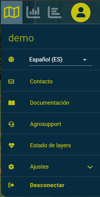
User menu
Within the user menu we can find:
Logged in username. Language selector of the tool. Contact. Clicking this button opens the email manager to send an incident to the technical team. Documentation. Allows access to the documentation website. Agrosupport. Allows access to the incident management tool. Layers Status. Allows you to know the health of the Layers system. Logout. Click here to exit Layers.
Search bar
In the search bar we can find the following options:
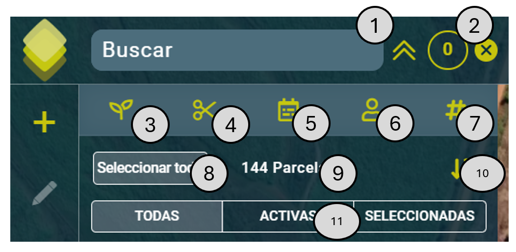
Plot finder. Allows filtering plots by entering field name, reference, or associated username. The arrows on the right expand or collapse the list of plots.
Go to selection. Inside this circle appears the number of plots that are selected either through the plot cards or through the selection on the map. By clicking on it we will enter the plot view.
Crop filter. Allows filtering plots by crop type.
Cut number filter. In certain crops such as sugarcane, this filter allows filtering by cut number.
Campaign start date filter. Allows filtering plots by campaign start date.
User filter. Allows filtering plots by user.
Campaign name filter. Allows filtering plots by campaign start date.
Select all. Allows you to select all filtered plots.
Filtered plot count. This is the number of available plots with the applied filters.
Sort. Allows sorting filtered plots alphabetically in ascending or descending order.
Selected plots. Allows displaying only Active, selected, or all plots.
Note: Filters applied in Dashboard or Map, as well as plot selection, are preserved when switching between the two tools.
Plot cards contain information about plot name, crop type, external reference, campaign start date, and associated user.
Selected asset: green background.
Not selected item: blue background.
Inactive: diagonal pattern.
Mouse over: white shading.
Tools
Report Manager. The Report Manager allows you to search and view existing reports as well as mark them to edit their status (open/closed). You can find more information here
New report. Allows generating a new report indicating the affected plot or plots and including, if the user deems it appropriate, a screenshot. You can find more information here
Tracking Excel. Allows you to download an excel file with statistical information about crop evolution by plot in the selected period. You can find more information here.
Download geometry JSON. Allows downloading a GeoJSON file (equivalent to a SHP) with the geometries of selected plots. You can find more information here.
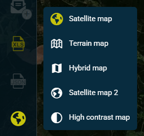
Background map change. Allows switching between main satellite map (default on first access), terrain map, hybrid map (includes roads and town names), secondary satellite map and high contrast map.
Measurement tools. Allows you to measure distance or area on the map.
Global layers activator. Allows disabling and enabling global layers to see a basic view of plots with their geometries, or when active, show the average values calculated for each plot according to the selector present in the tool.
Global Layers
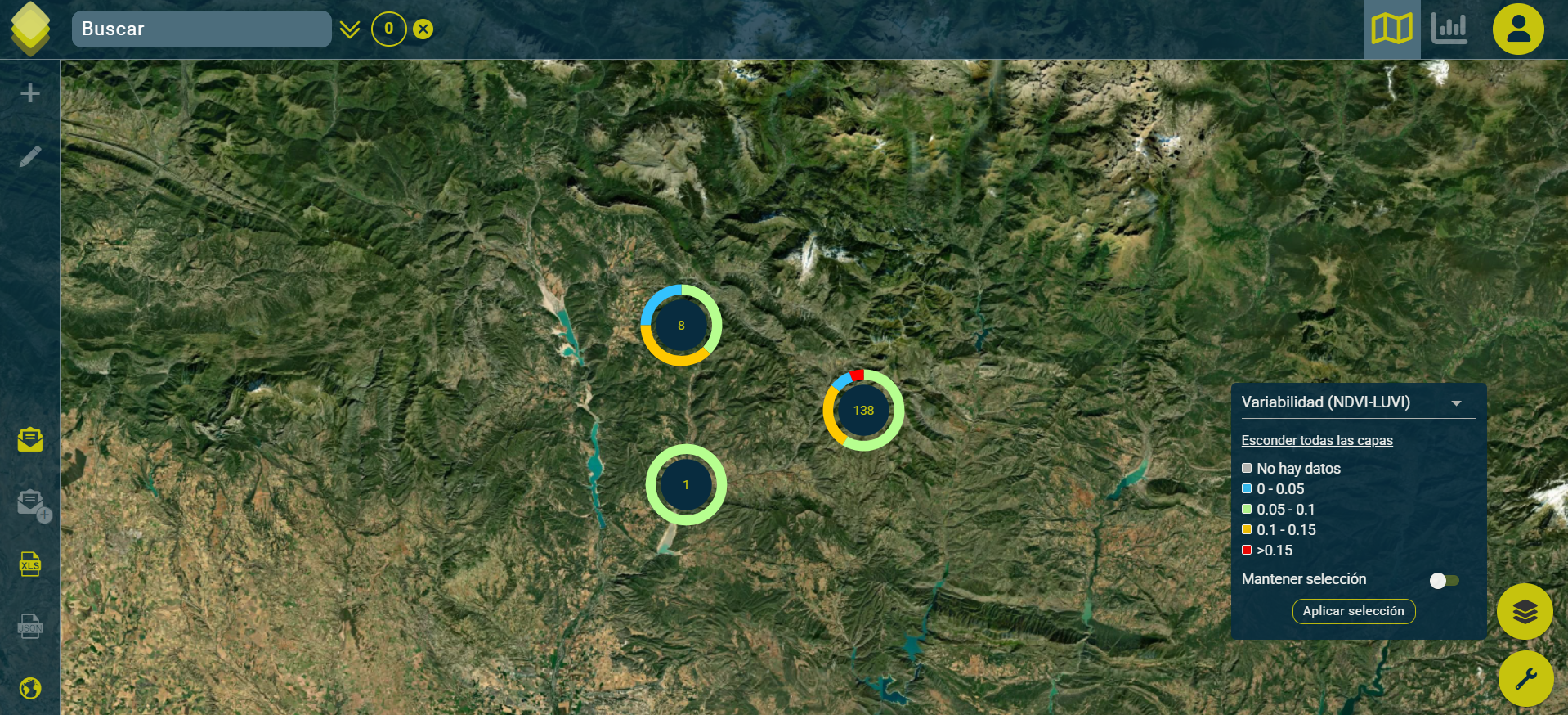
Global layers represent indexes of interest plot by plot. Each plot has an associated color that is referenced in the legend, where the intervals, categories or sequence and their related color are indicated.
These layers allow us to narrow down our work, as they let us easily visualize which plots require more of our attention. These are the global layers that we can view according to the products we have contracted:
Global Layer |
Layer type (according to legend) |
Associated Product |
|---|---|---|
Crop |
Categorical |
Crop Optimizer |
Variety |
Categorical |
Crop Optimizer |
Campaign |
Categorical |
Crop Optimizer |
Cut number |
Sequential |
Crop Optimizer |
Growing days (NDVI-LUVI) |
Sequential |
Crop Optimizer |
Vegetative Vigor (NDVI-LUVI) |
Fixed Intervals |
Crop Optimizer |
Variability (NDVI-LUVI) |
Fixed Intervals |
Crop Optimizer |
Vegetation Moisture (NDMI) |
Fixed Intervals |
Crop Optimizer |
Nitrogen-Chlorophyll (NDRE) |
Fixed Intervals |
Crop Optimizer |
Categorical SAR Biomass |
Categorical |
Crop Optimizer |
Water stress (LWS) |
Sequential |
Crop Optimizer |
% Fallas - Drone |
Fixed Intervals |
DroneGaps |
% Maleza - Drone |
Fixed Intervals |
DroneWeeds |
Failures |
Fixed Intervals |
Crop Optimizer |
Weed |
Fixed Intervals |
Crop Optimizer |
Expected harvest date (weeks) |
Sequential |
Crop Predictor |
Production estimate |
Sequential |
Crop Predictor |
Actual production from the previous campaign |
Sequential |
Crop Predictor |
Sucrose estimation |
Sequential |
Crop Predictor |
Polarization estimation |
Sequential |
Crop Predictor |
ATR estimation |
Sequential |
Crop Predictor |
(*) The global weed and failure layer only represents the area identified as weeds/failures. It does not represent the area identified as “possible weeds/failures”.
-What does the legend of the SAR BIOMASS layer mean?
The SAR BIOMASS legend is a categorical legend that ranges from level 0 to level 6, corresponding to each of them the following information:
CATEGORICAL SAR BIOMASS |
DESCRIPTION |
Color |
|---|---|---|
0 |
Soil - Very low |
Brown |
1 |
Low |
Red |
2 |
Low-medium |
Orange |
3 |
Medium |
Green |
4 |
Medium - high |
Light blue |
5 |
High |
Dark blue |
6 |
Cycle days out of range (+ 700 days) |
Black |
What information is analyzed to generate the global layers?
In general, the most up-to-date data available for each layer is shown, except in the case of layers related to satellite information such as: Growing days (NDVI-LUVI) / Vegetative Vigor (NDVI-LUVI) / Variability (NDVI-LUVI) / Vegetative Moisture (NDMI) / Nitrogen-Chlorophyll (NDRE) / Water stress (LWS), in this case, satellite dates from the last 30 days are used for the last season of each field that has a cloud percentage of 0%. The satellite data comes from Sentinel-2 and Planet.
Why do I see fields in gray?
Fields that do not have data for a specific index will be shown in gray.
Report system
Throughout the crop cycle, the reporting tool can help farmers and technicians identify anomalies early. For this purpose, both technicians and farmers have a reporting tool at their disposal to share via email and record in the report manager areas suspected of having, for example, emergence problems, weeds, diseases, or irrigation problems. This tool is also very useful for monitoring treatment responses.
Report Generation Tool
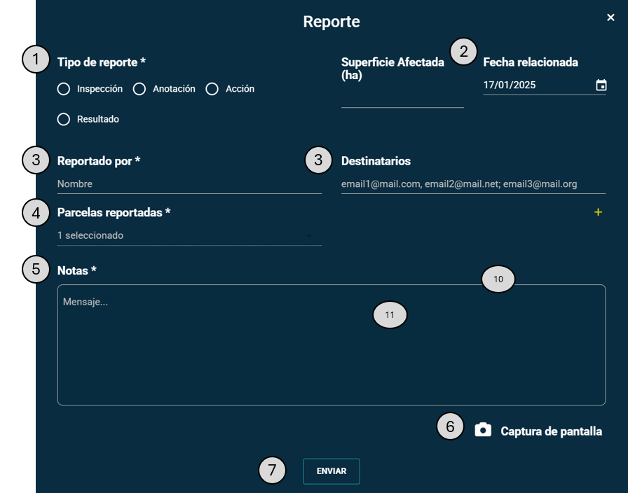
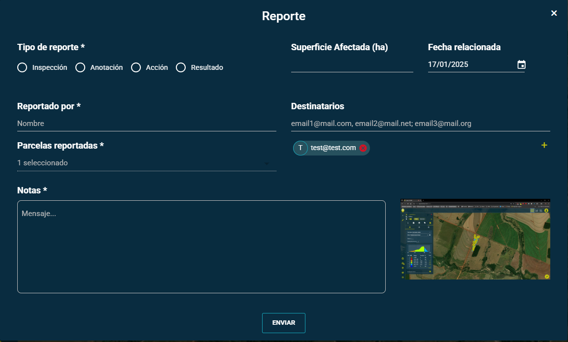
The Report Generation tool consists of the following elements:
Report classification. Allows classifying the report as Inspection, Annotation, Action, or Result, very useful for filtering reports as the campaign progresses.
Report details. Allows you to indicate the affected area in Hectares as well as the reference date of the report.
Communication. Allows you to specify who generates the report and a sequence of email addresses that will receive the email with the report.
Reported plots. In case there is more than one selected plot, it allows selecting which plot or plots the report refers to.
Notes. Allows you to include a brief text about motivation, next steps or other notes.
Add screenshot. Allows you to include a screenshot of both Layers and other elements that are open at the time.
Send. Generates the report with the information on screen, sends the email to the people in the list and saves all the information in the database so that the report, from this moment on, will be available in the “Report Manager”.
Report Management Tool
The Report Management tool shows the list of reports available to the user. It contains a search box in the upper right corner that allows filtering plots. Additionally, the different columns allow sorting the elements.
It is also possible to mark a report as ‘open’ (by default) or ‘closed’ in order to maintain control over detected incidents.

By clicking on one of the reports, you can access the detailed information available.

Progress Excel
Pulsando el botón  aparece un calendario para introducir el periodo de fechas de interés.

If no plot is selected, the Excel file will return information about all plots; If there are selected plots, the Excel file will only return information for these.

Download geometry JSON
By clicking the button, with previously selected plots, the geometries of these plots will be downloaded. If there are no selected plots, the download button remains disabled.
Map
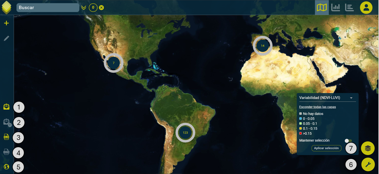
When accessing Layers, the Map view starts with a cluster visualization that allows quick identification of plot distribution according to the values of the global NDVI layer.
The map view shows the following basic tools:
Plot finder.
Plot selection.
Plot visualization.
Measurement tools: length (km) and areas (hectares).
Creation of plots.
Plot editor
Base map selector: satellite (default), terrain, hybrid, satellite 2, high contrast.

Creating plots
The plot creation tool allows you to generate a new working field through a simple form. The steps to follow are:
1 - Move around the map to the desired location. 2 - Use the plot creation button. 3 - Fill in the plot information. The legend below indicates which fields are required. It is recommended to fill in all fields. 4 - Draw the desired plot using the editing tools, which are point-by-point drawing, drawing circles, cutting, and moving around the map. 5 - Check the field characteristics using the map and measurement tools; and save.
Plot selection and visualization
In the Map view, you can select the plot or plots you want to analyze. This selection can be made by moving around the map, zooming in with the mouse wheel, and then clicking on the desired plot(s). You can also select all plots in an area by holding the ‘CTRL’ key and simultaneously clicking and dragging with the left mouse button to cover the desired area, or by using the search bar in the upper left, where different types of filters can be used to facilitate the search.
You can access the plot view by clicking the following button:

The number on the button indicates the number of selected plots.
Plot view
The plot view starts with the calendar selector open by default.
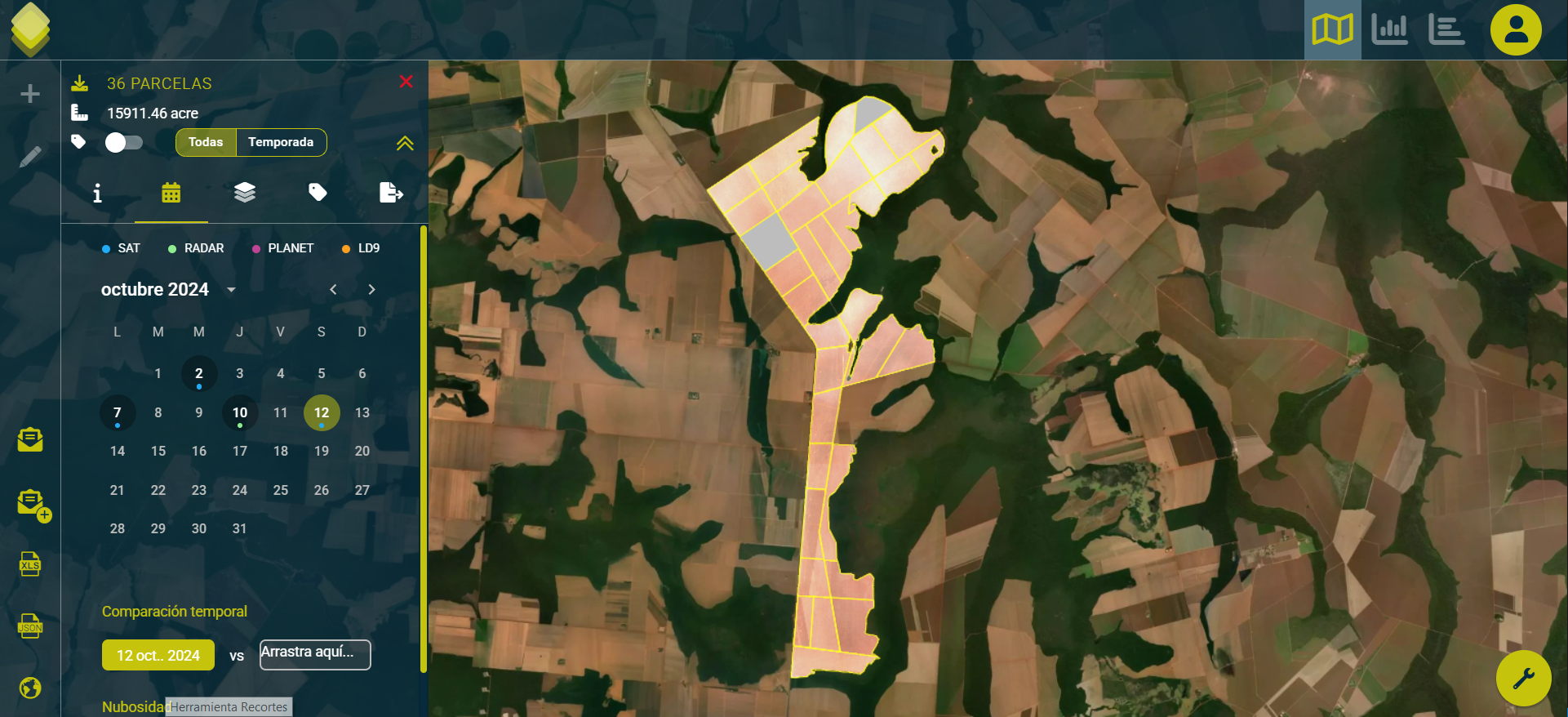
In the upper left, the following details and options are shown:
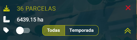
Download plot list - Number of plots.
Total area of selected parcels.
Show and hide the display of samples. - All registered / Current season only.
Cross to exit plot view
Up arrows to hide the side menu and have an expanded view of the map view.
In the menu below, the following options are shown from left to right:

List of selected installments.
Cloud filter date selector.
Available layers selector.
Available fixed layers selector (If available).
Sample Menu (Pins, Labels)
SHP files, deliverables and source files generator.
In the plot view, a card appears showing the plot name and a summary of its data. When more than one plot is selected, a plot counter appears. By pressing the button indicated below, it displays the complete list of plots with their extended details.

In the plot list, clicking on the information button displays the complete field information.
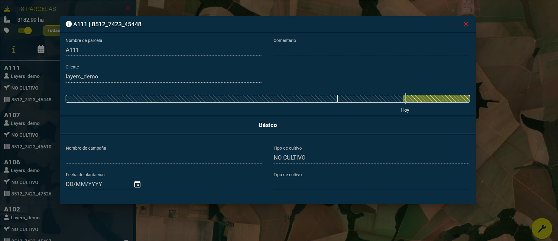
Plot editing
In the left static bar, there is the plot editing button, when pressed, the plot creation form appears where data can be modified. Once the data modification step is complete, you can proceed to edit the plot geometry, having the same tools available as in creation.
Data visualization by date and type
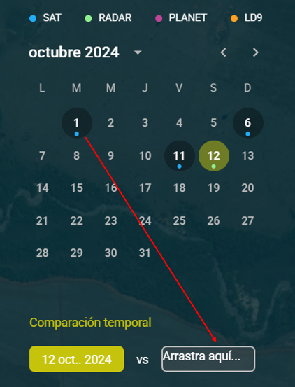
In the Calendar option, different dates can be selected. Color-coded, the calendar shows the dates when information sources (Contracted) are available:
Drone
Satellite
Radar
Planet
LD9
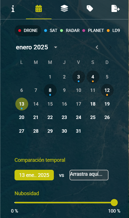
Additionally, if the plot has drone flights, clicking on the drone symbol redirects the calendar to the specific dates with available data.
Time comparison
The temporal comparison functionality allows you to visualize the crop’s evolution based on applied treatments or its natural evolution in each phenological phase. To use this tool, drag a date over the indicated box.
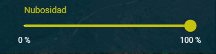
Cloud filter
Sliding the selector to adjust the cloud percentage allows us to hide from the calendar those dates where cloud coverage is higher than the indicated percentage, making it easier to select dates with the best possible conditions for analysis with adequate data.
When having more than one selected plot, the percentage of clouds present in each plot is considered individually, weighted by its area, understanding the selection of all plots as a single unit, and not as individual plots.
Layer visualization
In the layer selector tab, all available layers are shown for the date and data source, if more than one is available (e.g., Sat/Drone/radar)
By clicking on the eye (👁) of each layer, their visualization is activated.
By modifying the slider position, its transparency is adjusted.
By clicking on i the legend corresponding to each layer can be displayed.
The display order or overlay of layers can be altered by clicking on the desired layer and dragging it within the layer list. The top position in the list corresponds to the position in the overlay visualization
Plot view layers
“Weed” and “Failure” layers
The map view shows the area identified with presence and the area identified as possible. The remaining area, not corresponding to any of the previous two identifications, is shown transparent.
The failure layer identifies areas without crop presence. Note that if the area shown as failure is very high, it may be representing harvested fields, unplanted or under renovation.
The weed layer represents anomalies identified in the field vegetation.
Drone deliverables download
If the selected date corresponds to a drone flight, in addition to the specific layers, the deliverables generated for drone can be downloaded in their original format, to be processed and applied in specific machinery.
Drone deliverables download
Samples
This tool allows you to view the generated samples and their positions on the map.
Sample list
The represented position of the sample can be edited and modified manually. It may not correspond to the device location when the sample is saved or updated. When a sample is created or modified from a mobile device, the person taking the sample must verify that they are in the required position, or according to the agreed procedure, the sample pin can be edited to match the user’s position.
Present samples can be filtered using a text filter. This supports searching for multiple identifiers (sample ID, type, notes, and date) which can be defined individually, separated by commas.
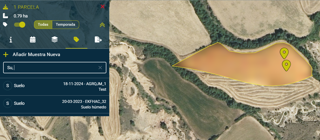
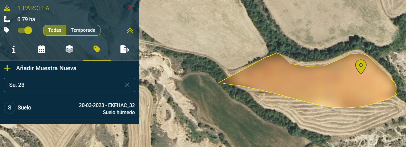
The applied filter remains active in the plot view, even when changing tools (change to calendar, layers…), or while the plot or plots for which the filter is applied are selected, even if plots are added to the selection.
Deselecting plots in the plot list, or by clicking the (x) of the sample filter, will remove the applied filter allowing you to view the complete sample list again.
Selecting a sample on the map or in the list allows you to view its details.
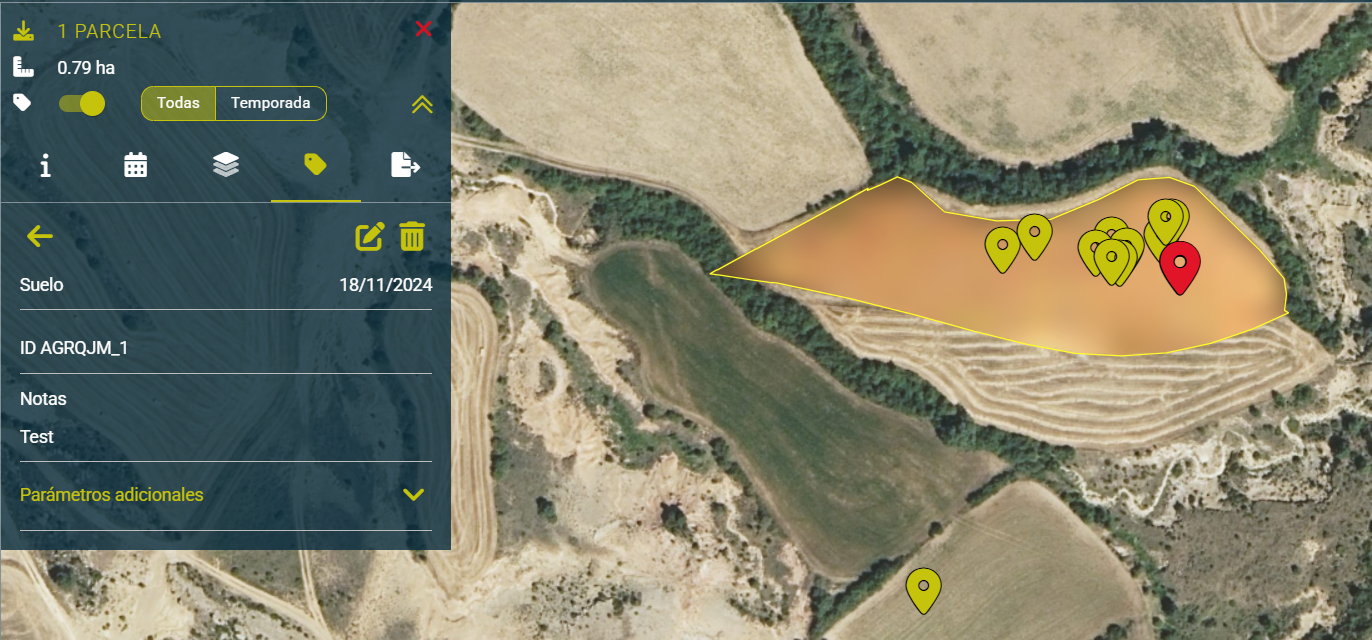
By clicking the edit icon, it can be modified or completed with details or image. The selected sample is highlighted in red on the map.
Additional sample information can be viewed by expanding the “Additional Parameters” menu
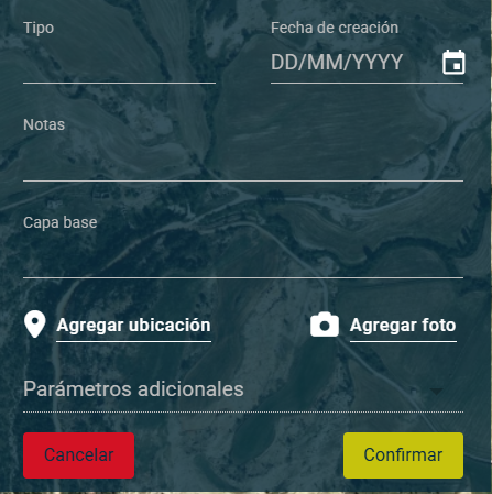
Sample creation
By selecting Add New Sample, Samples can be generated from a desktop, to be later completed in the field using the Layers App
Available parameters:
Sample type*
Creation date
Notes
Base layer*
Location*
Image
Additional Parameters
Send button
Cancel button
(*) - required
Base layer: You can select one of the layers from the selected date.
Location: You must place a marker in one of the selected fields.
Additional parameters:
You can select one of the parameters after selecting the sample type.
The input type depends on the additional parameter, it can be date/integer/decimal/text string.
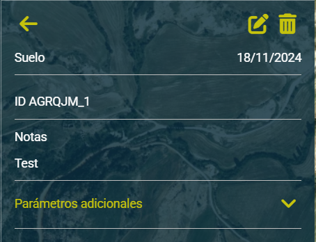
Edit and delete sample
When selecting a sample you can view the complete details.
At the top, you can find the option to return to the sample list, edit the sample, or delete the sample.
File Generator
The file generator is a tool that allows you to quickly obtain reports in PDF format or SHP files for variable rate application or analysis in a Geographic Information System (GIS).
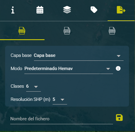
At the top there is a selector for the file to generate, between SHP, PDF and RAW.
SHP is usually used to perform subsequent edits or calculations in GIS tools, or to load into automated machinery for the application of fertilizers, manure, seeds, among others.
PDF allows generating the document with specific settings, as a guide or work record.
RAW allows downloading the original layer without any processing or modification.
The base layer selector allows you to choose between the layers available on the date selected in the calendar. If you want a different date, it must be previously selected in the calendar. After selecting the base layer, a histogram is calculated for the selected plot on the selected date. Additionally, a table appears showing ranges, areas, and percentages.
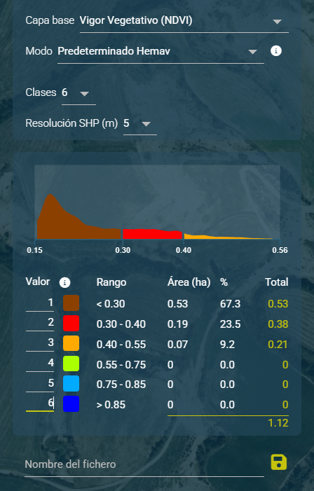
Mode Allows selecting between three distributions in the range classification:
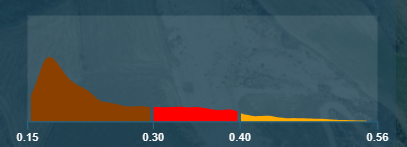
Default HEMAV: Ranges predefined by HEMAV that are generally appropriate for most fields in medium vegetative states. In the example below, the plot is without crop.
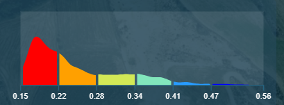
Equidistant ranges: Ranges of the same size will be generated according to the minimum and maximum values of the image. In cases where the image is very homogeneous, it is likely that no differentiation will be seen.
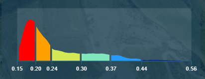
Index-adjusted ranges: Based on the image histogram, create ranges with a percentage of similar data in each range. Sometimes allows a distribution more adjusted to the area represented by each class.
Classes allows you to select the number of groups into which we want to divide the total range of values for the selected layer, between 2 and 10.
Resolution allows you to adjust the pixel size used in the generation of the SHP file.
Calculator This tool allows you to see in real time the distribution of classes according to the settings selected in the previous form.
Value These numbers can be modified according to application needs and are associated with each geometry in the exported SHP’s attribute table. Commonly adjusted to establish the amount of fertilizer or seeds to be applied per unit area. The right column shows the total amount to be applied according to the value entered per class, and the total per plot at the bottom.
Range indicates the maximum and minimum value used to calculate each of the classes of the selected layer.
Area indicates the surface area covered by each class in the selected plot, according to the selection made.
% indicates the percentage of surface area that each class represents in the selected plot.
Total shows the calculated value taking into account the number of units assigned in the first column ‘Value’, multiplied by the number of surface units included in the total Area. As a sum, the estimated amount to be applied is calculated according to the values set in each of the classes.

Weed and Failures For the “Weed” and “Failures” layers, the calculated ranges may vary between plots, so they are defined individually. In these two cases, the calculation of the area represented on the plot is shown classified by classes, differentiating between “Weed”, “Possible weed” and “No weed”. By selecting the base layer “Weed” or “Failures”, the File Generator simplifies its available options, predefining valid values: “Default Hemav Mode” and “3 classes”. Similarly, to visually represent the data resulting from this calculation, the density graph is replaced by a bar graph that differentiates the 3 classes mentioned above.
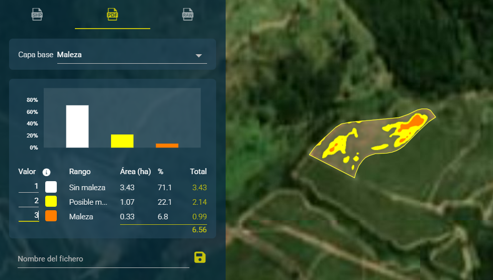
Save file allows storing the configured file in our system for storage or later use. We can specify the desired name for storage. Additionally, the system adds the following values to the filename: Selected layer_plot name_selected data date.

A continuación el detalle del archivo SHP generado.

Dashboard

Client Overview
In the initial Dashboard tab, different data is shown for the latest flight of each plot. These graphs have available filters for client, crop, plot, planting date range, and source type (satellite/drone).
It is also possible to select the date range from which you want to display information. In this Dashboard tab, only the most recent valid information from the range will be shown. That is: choosing for example the range from January 1 to 31, and if a plot has cloud cover from January 15 to 31, the information from January 14 will be shown relative to the cloud-free satellite pass.
Finally, it is possible to filter by value ranges in the indices. Thus, it is possible to filter only plots with greater variability. On the filtered plots, it is possible to filter again to select plots (for example) with a higher NDVI value.
Temporal evolution
Shows comparisons for the last two flights of each plot. You can filter by source (satellite/drone) and by flight date.
Thermal storage
Due to the great importance of climate parameter monitoring for agricultural management, HEMAV has incorporated this line of work in 2020. The first parameter to arrive, due to its relevance in all crops, management methodologies, and field work, is generic thermal accumulation.
This new tool shows the accumulated temperature from the time of sowing until present in the selected plot (only one plot). For this purpose, it takes into account the average temperature recorded in the area for each day within the interval.
It should be noted that the tool shows the accumulated data from the planting date registered in Layers up to the present. To modify this parameter, you need to go to the plot editing tool and modify the planting date. For crops without a registered planting date or with planting dates older than two years, the evolution over the last two years is shown.
Crop Predictor - Harvest Logistics
This section shows the evolution of the fields during harvest, available for all models (with or without field samples).
Models with field samples or mixed (combines samples with harvest date):
They allow visualizing the estimation throughout the entire crop cycle, from sowing (or cutting) to harvest. This graph is used as the main example because it shows the two forms of analysis:
By weeks of cultivation (left graph): all selected plots are aligned taking the start of the cycle as a reference (day 0). This allows comparing fields of the same age, regardless of their planting date. In addition, reference bars are included with the average of the top 25% of plots (top 25%) to detect practices or techniques associated with higher yield.
By calendar date (right graph): the real evolution of each plot is observed at each moment of the year. Thus, plots in initial phases can be easily identified compared to the more advanced ones.
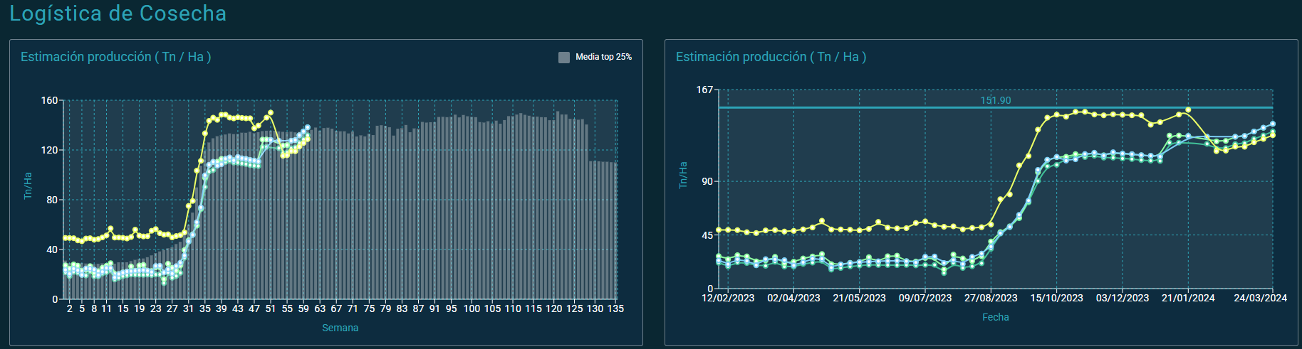
Models without field samples
In this case, the visualization is limited to a reduced time range: estimates are shown from four weeks before to four weeks after the estimated harvest date.
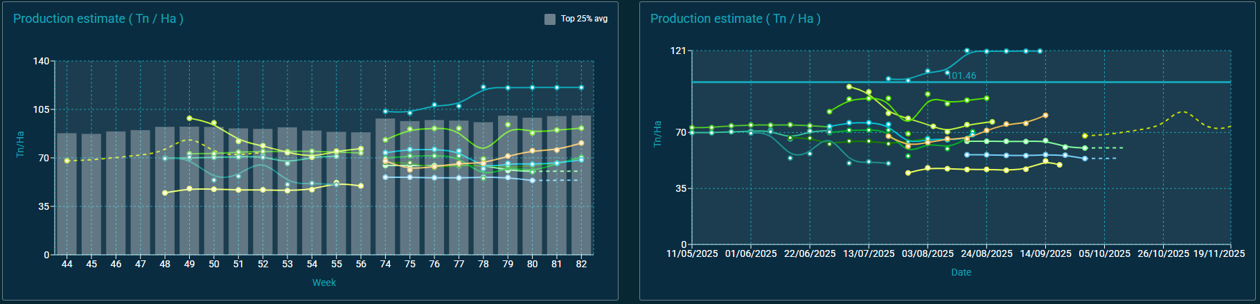
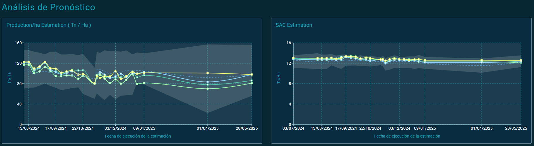
Crop Predictor - Forecast Analysis
This graph shows how predictions for the final harvest have been changing over time, allowing for the analysis of the consistency and evolution of the models.
X-axis: date on which each estimation was made.
Y-axis: estimated production value.
Prediction lines per field: reflect the evolution of estimates over the different calculation dates.
Shaded gray area: shows the range of minimum and maximum values among all plots in the account (client variability).
Dashed blue line: indicates the average estimation considering all plots in the account.
⚠️ Important: Altering the estimated harvest date can lead to significant changes in the calculations.